Color is one of the first things customers notice about packaging. It influences how a product feels, how premium it looks, and how easily a brand is recognized on the shelf.
That’s why choosing the correct Color mode is not just a technical decision — it directly affects print quality, consistency, and brand perception.
One of the most common questions in packaging design is whether to use RGB or CMYK. Understanding the difference early helps brands avoid costly printing errors and unexpected results.
Understanding Color Modes in Packaging Design
CMYK and RGB are two different color systems designed for different purposes.
- RGB is created for digital screens such as phones, tablets, and monitors
- CMYK is designed for physical printing using ink
Designs often appear brighter on a screen than they do once printed. In packaging, where color consistency must be maintained across large production runs, this difference is especially important.
RGB Color Mode?
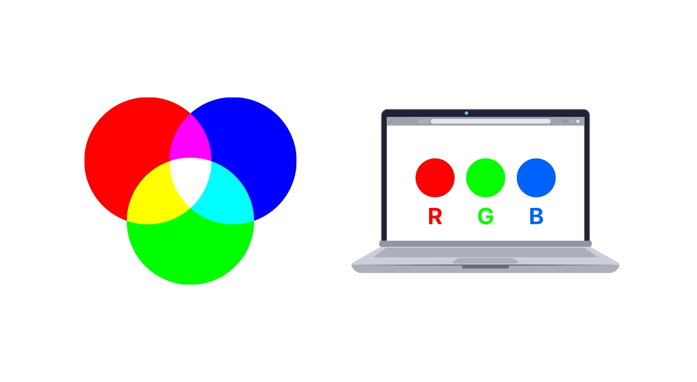
RGB stands for Red, Green, and Blue. It is an additive color model that creates colors by combining light.
The more light added, the brighter and more vibrant the color appears. This allows RGB to produce bold, eye-catching colors that look impressive on digital displays.
Where RGB Works Best
RGB is ideal for:
- Websites and eCommerce platforms
- Digital advertisements
- Social media graphics
- Online product images
However, RGB is not intended for traditional print production.
Limitations of RGB for Packaging Printing
One of the main challenges with RGB is that screens and printing presses generate color in completely different ways.
Before printing, RGB files must be converted to CMYK. During this conversion:
- Colors often lose brightness
- Some shades shift unexpectedly
- Designs may appear duller than anticipated
For packaging, where accuracy and consistency are critical, relying on RGB files can introduce unnecessary risk and lead to reprints or delays.
_________________________________________________________________
CMYK Printing?
CMYK stands for Cyan, Magenta, Yellow, and Key (Black). It is a subtractive color model used in commercial printing.
CMYK creates color by layering ink on physical surfaces, absorbing light rather than emitting it. This method accurately reflects how colors behave on packaging materials such as cardboard, corrugated board, and kraft paper.
Because packaging is printed with ink, CMYK is the industry standard for production.
 Benefits of Using CMYK for Packaging
Print Accuracy and Consistency
CMYK enables consistent color reproduction across multiple print runs, which is essential for brand recognition.
Material Compatibility
CMYK printing takes into account how colors appear on different materials, including:
- Coated paperboard
- Uncoated cardboard
- Kraft and recycled packaging
Reliable Production Results
Designing in CMYK reduces surprises during printing and ensures that approved artwork closely matches the final printed packaging.
How Packaging Materials Affect Color
Packaging materials play a major role in how colors appear once printed.
For example:
- Kraft board naturally softens colors
- Uncoated surfaces absorb more ink
- Coated materials produce sharper, brighter results
RGB designs cannot accurately predict how ink will interact with real materials. CMYK designs allow adjustments to be made based on the selected substrate, which is especially important for subtle tones and brand-specific colors.
When RGB Is Still Useful in Packaging Design
RGB still has value during the early stages of design.
It is commonly used for:
- Concept visuals
- Digital mock-ups
- Marketing presentations
- Product listings
That said, final packaging artwork should always be prepared and approved in CMYK before printing to ensure accurate production results.
CMYK vs RGB and Brand Consistency
Consistent color builds trust.
When packaging colors vary between batches or fail to match digital representations, brand perception can suffer. Designing in CMYK from the beginning helps maintain color consistency across:
- Production runs
- Multiple suppliers
- Different regions
This consistency becomes increasingly important as brands scale their packaging operations.
Common Color Mistakes in Packaging Printing
Many packaging issues result from avoidable color mistakes, including:
- Submitting RGB files for print
- Ignoring material differences
- Skipping color proofing
- Poor communication between designers and printers
These errors often lead to higher costs, delays, and reprints. Addressing color decisions early helps prevent these problems before production begins.
Choosing the Right Color Mode for Packaging
For physical packaging, CMYK is the most reliable and professional choice.
While RGB remains useful for digital design and marketing, packaging artwork intended for print should always be created, reviewed, and approved in CMYK. This ensures predictable results and aligns design intent with real-world manufacturing.
Working closely with an experienced packaging printer also makes it easier to fine-tune colors based on materials and print methods.