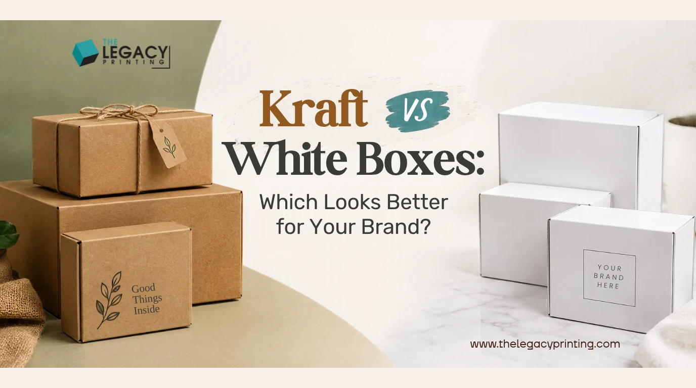
In the kraft vs white boxes choice, your artwork picks the winner. Kraft looks best with simple, dark logos and a natural feel. White looks best with full color, photos and soft pastels. If you choose the wrong one, your brand colors can print dull or muddy, so decide before you send your files.
We've made custom boxes on both stocks for more than 10 years and over 10,000 orders. Each question below gets a short answer first. Then we explain the "why," so you can make the call for your own product.
Kraft vs White Boxes: Which One Looks Better for Your Brand?
Neither one looks better for everyone. Kraft wins for earthy, handmade and simple brands. White wins for colorful, clean and photo-heavy brands.
Here are the key answers side by side.
| Question | Kraft (brown) | White |
|---|---|---|
| What feel does it give? | Natural, handmade, earthy | Clean, bright, modern |
| What artwork works best? | One or two dark colors, bold logos | Full color, photos, gradients, pastels |
| How true are the colors? | Colors shift warmer and darker | Closest to your design file |
| Does it hide shipping scuffs? | Yes, dirt and marks blend in | No, scuffs and fingerprints show |
| Is it strong? | Depends on board and flute, not color | Same rule applies |
| Does it cost more at The Legacy Printing? | No extra premium in almost every category | Price depends mostly on ink and finishes |
| Good fits | Candles, coffee, bakery, apparel | Skincare, cosmetics, gifts, bright brands |
How can I pick in 30 seconds?
Put your logo and main artwork in front of you. Then run this quick test.
- Your logo is one or two dark colors (black, navy, forest green, deep red)? Kraft will look great.
- Your design uses photos, gradients or pastels? Go white.
- You must match an exact brand color, like a specific pink? White is the safer bet.
- You want a natural look but brighter print? Ask about white kraft, covered below.
What Is the Difference Between Kraft and White Boxes?
The main difference is bleaching. Kraft is brown because its wood pulp isn't bleached. White board is bleached or has a white top layer.
What is a kraft box?
A kraft box is made from brown paperboard that skips the bleaching step. Kraft paper has long wood fibers, which help it resist tearing. You can often spot small flecks and texture on the surface, and that raw look is a big part of its charm.
What makes a white box white?
White boxes use bleached board, which means the brown pulp has been treated to turn it white. A common type is SBS (solid bleached sulfate), a smooth, bright white board made for sharp printing.
Another is CCNB (clay coated news back). It has a white printing face and a gray recycled back, and many folding cartons use it.
Where do white kraft boxes fit in?
White kraft boxes sit in the middle. They use kraft board with a white top layer, sometimes called white-top kraft or bleached kraft. You keep kraft's strength, but colors print brighter.
On corrugated board (cardboard with a wavy layer between two flat sheets), the white layer goes on the outer flat sheet. That sheet is called the liner.
Is a white box stronger or weaker than a kraft box?
Color doesn't decide strength. Construction does, the same way paint color doesn't make a car faster. Strength comes from board thickness and, for corrugated, the flute, which is the wavy middle layer.
Thin E-flute is common for neat mailers, while thicker B-flute adds more crush protection. So a white B-flute box beats a kraft E-flute box for strength, and the reverse holds too.
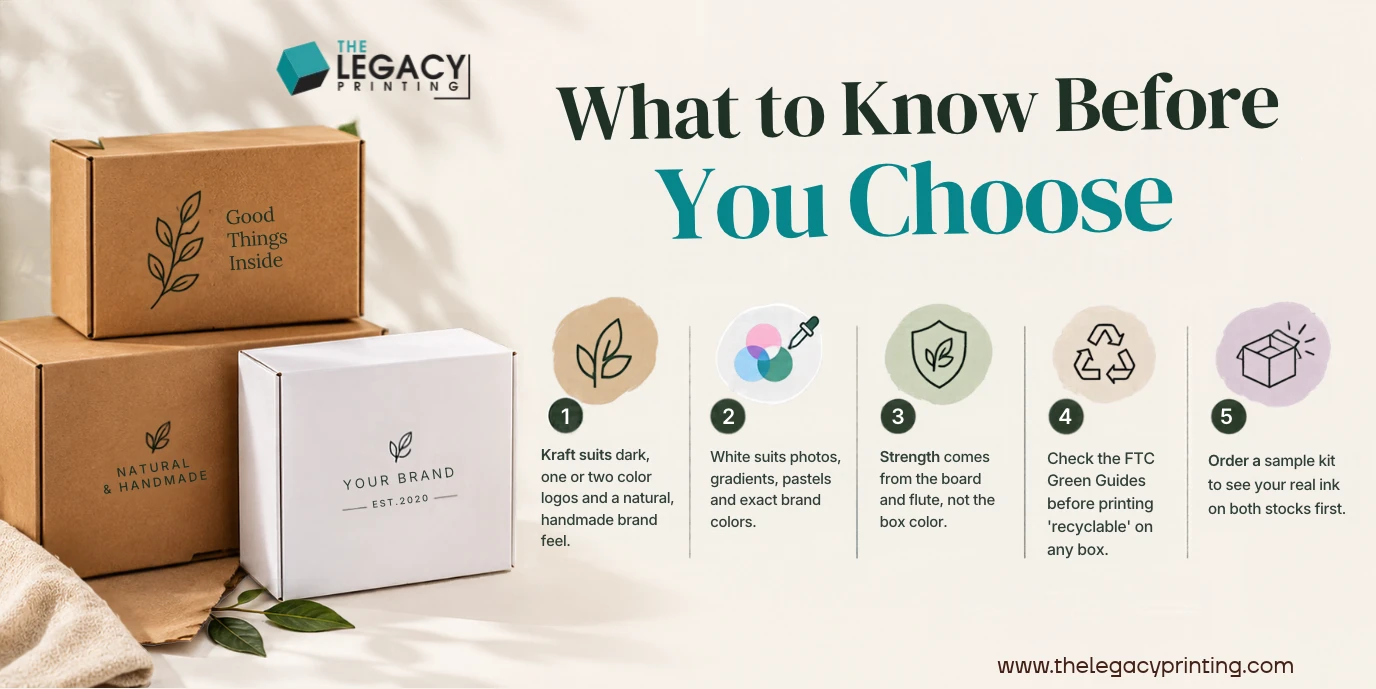
What to Know Before You Choose
How Does Each Color Shape the Way People See Your Brand?
Your box color is the first thing customers notice, before they read a single word. Kraft says "natural and crafted." White says "clean and polished."
What does a kraft box say about my brand?
Kraft feels honest, warm and small-batch. It fits brands that want to look handmade or close to nature. For example, a candle maker with a black, one-color logo on kraft looks right at home, and so does a coffee roaster or a soap brand.
What does a white box say about my brand?
White feels fresh, modern and premium. It works like a blank sheet of paper, so the colors you print stay true. That's why white is a common pick for skincare and beauty, where soft shades and product photos need a clean base.
Do kraft boxes look cheap?
Not when the design is planned for kraft. Kraft only looks cheap when bright, full-color art gets forced onto it. Add gold foil, a debossed logo or a spot UV shine, and a kraft box can feel refined and deliberate.
Does Kraft Packaging Print Well?
Yes, with dark inks and simple designs. It struggles with bright colors, pastels and photos, because the brown base shows through the ink.
Why do colors look different on brown board?
Most printing inks are see-through, so the board color mixes into them. It's like looking at your design through tinted sunglasses. Yellow turns mustard, light pink turns dusty, and pale blue can look grayish.
Kraft also soaks up more ink, a bit like a paper towel compared with glossy paper. Light inks can sink in and look flat.
This matters most for CMYK printing, which mixes four inks (cyan, magenta, yellow and black) to make full color. On white, those mixes look as planned. On kraft, every mix shifts warmer.
What artwork works best on kraft?
Bold, simple artwork in one or two dark colors works best. Try these ideas:
- A black or deep-colored logo with plenty of open space
- Line drawings, stamps and simple patterns
- A Pantone (PMS) spot color, which is one premixed ink chosen to match a brand shade
- Thick fonts instead of thin, delicate ones
Can I add white ink, foil or spot UV to kraft?
Yes, and these extras give kraft its premium look. White ink can go down first as an underlayer, so the colors on top look brighter. It works like primer on a wall before you paint. It does add an extra print pass, which can affect cost.
Finishes work well on kraft too:
- Foil stamping: thin gold, silver or holographic foil pressed onto the box
- Spot UV: a shiny clear coat on chosen spots, like your logo
- Embossing and debossing: raising your design out of the board or pressing it in
When is white the safer choice?
Choose white when color accuracy is part of your brand. Photos, skin tones, gradients and pastels all need a white base. It's also the right call if a retailer or partner expects an exact color match.
For feel and protection, you can add matte or gloss lamination (a thin protective coating) or a soft-touch finish.
The print method matters as well. Digital printing needs no plate setup and suits low quantities. Offset printing suits large runs with CMYK color. Our guide on offset vs digital printing for custom packaging explains which fits your order.
How can I see real ink before I order?
Order a sample kit. Kits come in 1 color, 2 colors, 4 colors (CMYK) or custom Pantone, and holding real printed board tells you far more than a screen can. Before production, our team also sends a free digital 3D rendering of your box.
Kraft or White Mailer Boxes: Which Ships Better?
For shipping, kraft hides wear better. White looks sharper on arrival, but only if it survives the trip clean.
Which color hides shipping wear better?
Kraft does. Boxes get rubbed, stacked and handled many times before they reach your customer. On kraft, small scuffs and dirt blend into the brown, while on white the same marks and fingerprints stand out. If your boxes ship without an outer carton, that's a strong point for kraft.
Can I mix kraft and white in one box?
Yes, and a hybrid box is a smart middle option. One popular setup pairs a kraft outside with a white, fully printed inside. The brown exterior handles the trip, and the bright inside surprises your customer.
The reverse works too: a clean white outside with a natural kraft inside. Ask our team which board options fit your box style.
How do I make the unboxing special on a small budget?
Put your design effort on the inside. A plain kraft mailer with a bold printed interior feels like opening a gift. Add tissue paper, a thank-you card or a simple insert to hold the product in place, and ask us whether inside printing works for your box style.
What Really Changes the Price of Kraft and White Boxes?
The board color is rarely the biggest cost. Ink coverage, finishes, box size and order quantity usually matter much more.
Are finishes and ink coverage the bigger cost?
Yes, in most orders. A box printed edge to edge in full color uses far more ink than one with a single logo. Foil, embossing and spot UV each add a step, and white ink on kraft adds a pass. At The Legacy Printing, kraft paper and recycled cardboard carry no extra premium in almost every category.
How many boxes do I have to order?
You can start with as few as 50 pieces! That makes custom kraft boxes for small business launches easy to test. You could try kraft on one product line and white on another, then compare. Our guide to small order custom boxes starting at 50 pieces shows how to plan a first run.
Are there setup or shipping charges?
There are no die or plate charges, and shipping is free anywhere in the USA. A die is the cutting tool that shapes your box, like a cookie cutter for cardboard. Plates are used in some printing methods.
Our free design team also prepares your print-ready artwork and dieline. That's the flat outline that shows every cut and fold.
Eco-Friendly Kraft Packaging: What Can You Honestly Claim?
Kraft looks eco-friendly, but the claims on your box must be accurate. Both kraft and white paperboard can be recycled, and US rules control what you can print.
Is unbleached kraft greener than white board?
Kraft skips the bleaching step, and many buyers link its brown look with a lower-impact choice. Still, color alone doesn't prove a box is greener. Recycled content counts too.
Post-consumer recycled content means fiber from paper that people already used and recycled. Our eco-friendly boxes come in kraft paper and recycled cardboard options.
How well do cardboard boxes get recycled in the US?
Very well, according to federal data. The EPA containers and packaging data shows corrugated boxes were recycled at a 96.5 percent rate in 2018. Paper and paperboard packaging overall reached 80.9 percent that year.
That EPA series ends in 2018. Industry groups use other methods, so their numbers aren't directly comparable. A national rate also can't prove that your specific box will be recycled.
Can I print "recyclable" on my boxes?
Only if you meet the federal rules. The FTC Green Guides (16 CFR Part 260) allow a plain "recyclable" claim when recycling facilities reach a substantial majority of people where the item is sold. Substantial majority means at least 60 percent.
If access is lower, you should qualify the claim, and the lower the access, the stronger the qualifier should be. For example, you can state the percentage of consumers or communities that have access to recycling.
Want to understand the terms? Read our guide on compostable vs biodegradable vs recyclable packaging.
How can customers keep boxes recyclable?
Keep them clean and dry. The EPA's commercial recycling tips note that wet cardboard is often rejected at recycling facilities. A short "please recycle when dry" line inside the lid makes a friendly reminder.
Which Box Color Is Best for My Brand?
The best box color matches your product, your palette and how the box gets sold. Use this table as a starting point, then test with a sample kit.
| Product type | Our usual pick | Why | Print and finish idea |
|---|---|---|---|
| Skincare and cosmetics | White or white kraft | Pastels and exact shades stay true | Full color, matte lamination, gold foil |
| Clean or natural beauty | Kraft | Matches an earthy brand story | One dark color plus foil logo |
| Bakery and treats | Kraft or white | Kraft for rustic, white for bright cakes | Window to show the product |
| Candles and soap | Kraft | Feels handmade and warm | Debossed logo, black ink |
| Coffee and tea | Kraft | Fits a roasted, natural look | One or two spot colors |
| Apparel | Kraft or hybrid | Hides shipping wear | Kraft outside, printed inside |
| Subscription boxes | White or hybrid | Bold art makes each box an event | Full color inside and out |
| Gifts and jewelry | White | Clean base for premium touches | Embossing, foil, ribbon |
Which color suits beauty and cosmetics brands?
White usually wins for beauty. Lipstick shades, skin tones and soft gradients need a white base to look right. Natural and vegan brands are the exception, because kraft supports their story. Browse our custom cosmetic boxes to see styles that work on both stocks.
Which color suits food, coffee and candles?
Kraft fits most of these well. It matches the warm, crafted feel of baked goods, roasted beans and hand-poured wax. A bakery selling pastel cupcakes might still prefer white, though. Ask our team which materials suit your food product, and see our custom food boxes for style ideas.
Which color suits CBD, apparel and subscription brands?
Both colors can work here, so let your design lead. CBD brands should plan space for state-specific labeling, and our cannabis packaging includes child-resistant closures and areas for those labels. Apparel and subscription brands often do well with a hybrid mailer.
What Mistakes Should You Avoid When Choosing Kraft or White?
Most problems come from skipping a test or making a claim you can't back up. Watch for these:
- Sending bright CMYK art to kraft without a test. Your screen shows white behind the colors, but the box won't.
- Expecting pastels on kraft. Light shades fade into the brown.
- Forgetting white ink adds a print pass. Plan for it in your design and budget.
- Printing "recyclable" without checking the FTC rules.
- Assuming white is weaker. Pick the board and flute for the job, then pick the color.
- Ignoring how the box ships. White boxes sent without an outer carton will pick up scuffs.
Frequently Asked Questions
Which looks better, kraft or white boxes?
The better look is the one that matches your artwork. Kraft looks best with simple, dark designs and a natural brand. White looks best with color-rich art, photos and clean, modern brands.
Are kraft boxes cheaper than white boxes?
The gap is often modest, and at The Legacy Printing kraft carries no extra premium in almost every category. Ink coverage, finishes, box size and quantity move the price more.
Can white ink be printed on kraft boxes?
Yes, as an underlayer or as a design color. It makes the colors on top look brighter. It does add an extra print pass, so share your design with our team first.
What is white kraft packaging?
White kraft packaging is kraft board with a white top layer. It keeps kraft's strength but gives you a brighter surface for color printing.
Are kraft boxes more eco-friendly than white boxes?
Kraft skips bleaching, but both stocks can be recyclable paper packaging. The honest answer depends on recycled content and local recycling access. Follow the FTC Green Guides before you print any eco claim on the box.
Can I get a sample before ordering in bulk?
Yes, you can request a sample kit before a full order. Kits come in 1 color, 2 colors, 4 colors (CMYK) or custom Pantone, so you can see real ink on board before you commit.
Can you print inside the box?
Inside printing is possible on many box styles. It's a popular way to add a surprise to a plain kraft mailer. Ask our team if it works for the style you choose.
Next Step: Get a Free Quote and Free Design Proof
Still not sure? Send us your logo and product size, and we'll help you decide. Our free design team builds your dieline and print-ready artwork, and you approve a 3D rendering before anything goes to print. Orders start at 50 pieces, with no die or plate charges and free shipping across the USA.
We're a BBB accredited business, rated 4.9/5 from 1,159+ orders and reviews. First-time customers save 20% on their first purchase! You can also reach us at 800 719 2780 or sales@thelegacyprinting.com.
Get a free quote and free design proof and see how your brand looks on kraft, white or both!